On 'Brat' and the phenomenon of "font memes"
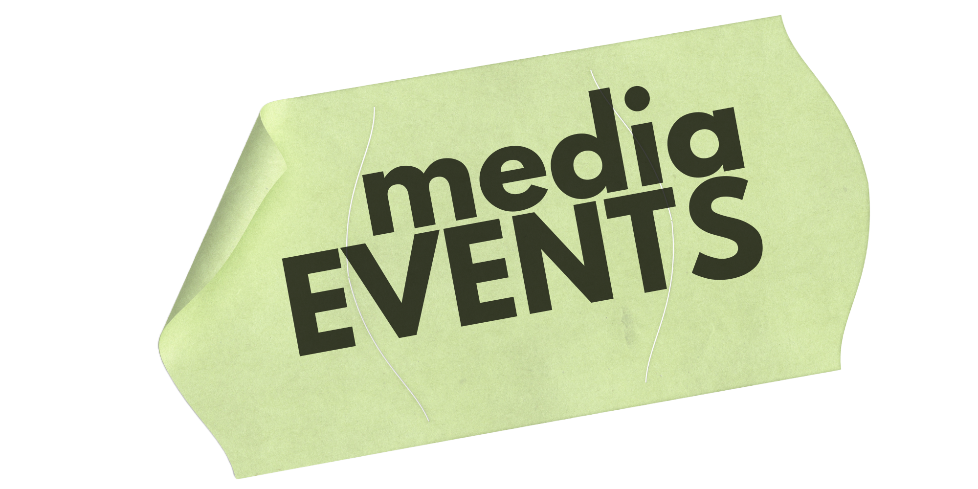
MEDIA: Brat (the album cover)
Event: Brat (the album)
What is early? What is late? What is big, what’s just “some shit that’s on the internet,” where is the line, and is the line even a thing? I ask these questions because I genuinely have no idea if Charli XCX’s Brat is the album of the summer/year/mid-2020s or if its viral spread is quarantined to a relatively niche audience whose outer edges stop with Kyle MacLachlan prostrating himself before the online hordes in a green t-shirt.
The most important thing is that it feels like a big album, though, the sort of Event that Gets People Talking thanks to a Multimedia Strategy That Creative Directors Will Try To Emulate In A Campaign. You’re picking up what I’m laying down over here. Anyways let’s talk about Brat memes.
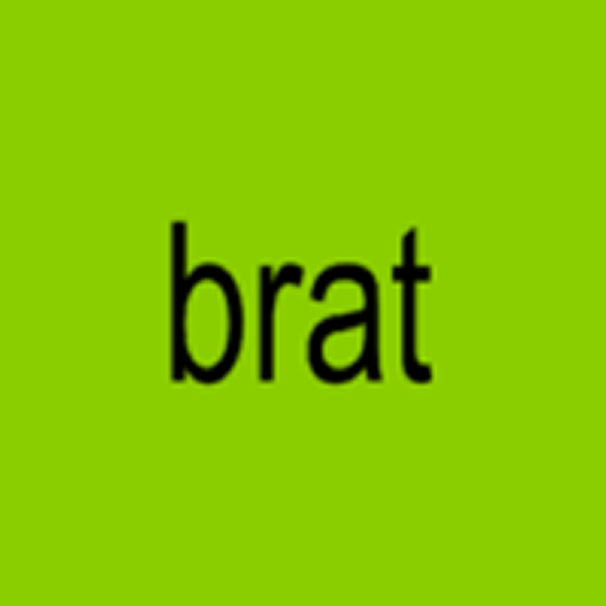
You have, doubtlessly, seen other images resembling these in your various feeds. White or that shade of green, Arial condensed, the letters a bit blown out. They all come from this site, the straightforwardly named Brat Generator dot Com, which does the exact thing you’d assume it would. It takes text and makes it look like the Brat cover.
This is, if we’re being honest, a brilliant stroke of marketing from Charli and her team. The cover matches the mood matches the music matches something larger happening in culture where stuff feels kinda messy and half-assed — or, if not half-assed, un-self-consciously deranged — in a charming way. The much-ballyhooed “vibe shift” has occurred, but only because keeping up with the previous vibe of prim propriety was exhausting and expensive, and it’s entirely possible that the jobs are not coming back. It’s internet rabbit holes and inscrutable DIY from here on out, and the album cover’s gotta look like a screenshot of some shit you made yourself in two minutes on your phone.
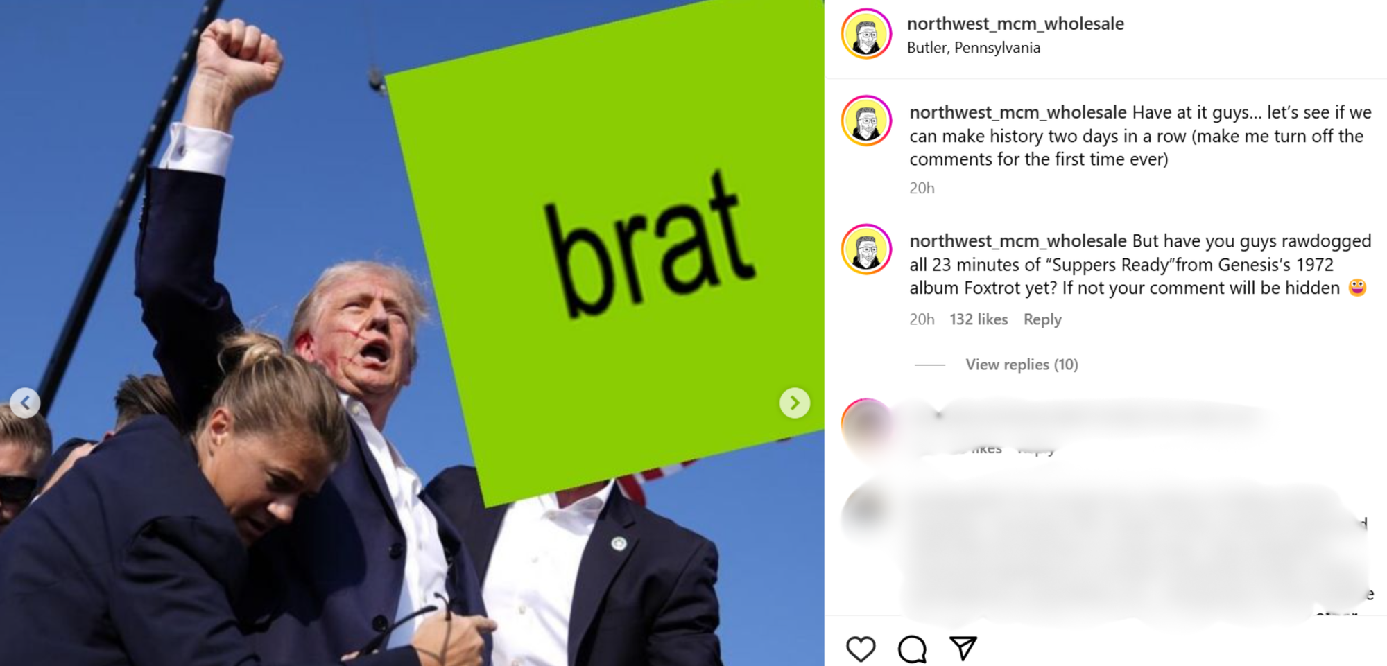
My friend, the media theorist and writer Ruby Justice Thelot, has written that memes can be understood as a “radioactive cultural products,” due to the way they tend to spread through culture, usually from the originator to a class of particularly plugged-in internet people to larger and larger publications and accounts, accumulating more and more visibility but decaying in the process. Sometimes this can refer to simply the decreased meaning or potency of a meme: The dude who yelled HAWK TUAH at Bryson DeChambeau definitely didn’t mean in an even remotely sexual way; he was just a denizen of the zynternet, and the picture of Trump, bloodied ear with fist raised into the air, was requisitioned by the brain rot community about seven milliseconds after it became clear he was basically fine.
On top of that, though, memes have a tendency to degrade physically as well, becoming more and more pixelated with every screenshot until the haze of history becomes part of the meme itself. Think the Bugs Bunny “Lord forgive me but its time to go back to tha old me” meme, or any number of iconic DJ Khaled IG posts from seven interfaces ago. The degradation almost acts as proof of memory in these cases.
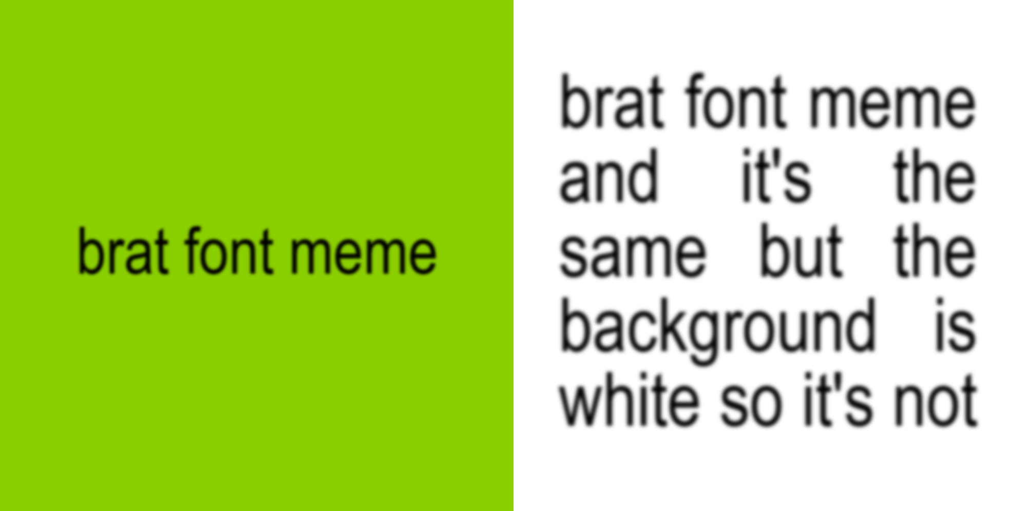
The fun thing about the Brat cover is that it scans as almost a readymade, a fictional meme in the middle of this pattern of decay. The letters are blown-out, like they were printed on an Epson from 2006 — which, given that the record sounds like big-room bloghouse with some A Grand Don’t Come for Free cosplay thrown in for good measure, is probably the point. Two decades of high-speed internet have irreparably screwed up my internal timeline, but it feels like the cover was a meme even before the album’s release. Either way, Charli and her team took pains to lean into the bit, first re-stylizing each of her other album covers on streamers to follow the same format, then releasing the deluxe edition of the record featuring a white cover and the instantly iconic “so it’s not” phrasing.
Per Ruby’s theory, the intent behind the memes quickly widened from “I’m doing this to signal my in-group status re Charli” to “I’m doing this to signal that I’m on the internet and know about the meme” to “the Brat cover and its underlying memes are all just stuff you post on the internet,” as evidenced by, uh, this:
To zoom out for a second: Typefaces, in general, are monumentally powerful tools when it comes to communicating the meaning embedded into words themselves. A la…
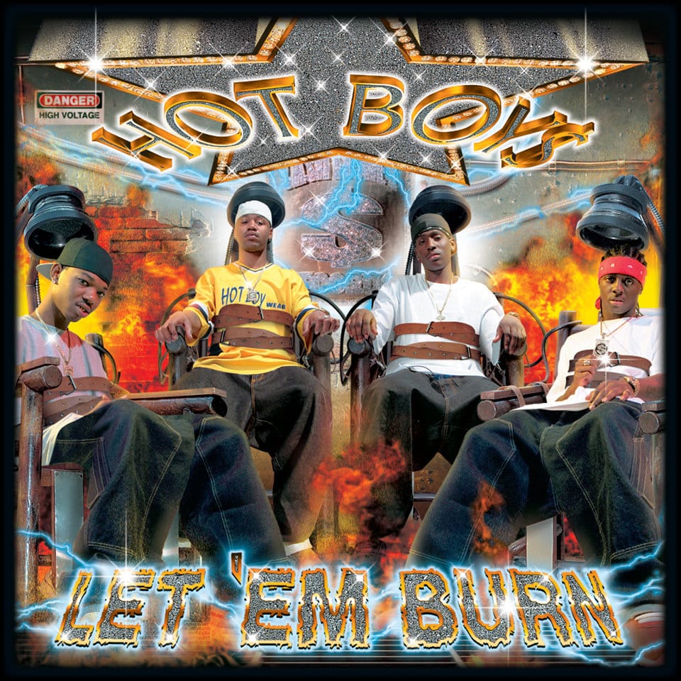
The above image is so brain-breakingly literal that it almost bends around back to abstraction. The Hot Boys’s album is called Let ‘em Burn, and the letters are on fire. (Try not to think about how the Hot Boys themselves are strapped into electric chairs; the cover for Wayne’s solo album The Block Is Hot has similar lettering and is more thematically coherent.) Such perfect confluence of words’ meaning and the way in which they are physically presented was not always a thing, though.
Hundreds of years ago, the relationship between the way a text appeared aesthetically and the actual message it was trying to convey wasn’t as clear. This is partially because Pen & Pixel had not yet started designing album covers for No Limit/Cash Money/Suave House et al, but mainly because printing presses used typefaces that were collections of hand-carved letter blocks, and those things were made by artisans who liked to put their own imprimaturs upon their work, and because there wasn’t a ton of stuff out there to read you could spend time admiring the giant squared letter that began a chapter for its intrinsic charms. The people who laid these works out similarly viewed their craft as an art unto itself, mixing typefaces around and tossing in ornate borders and random pictures and other shit onto a page in order to showcase their unique style. The design and content were at odds with themselves, each crying out for attention.
Fast-forward to the mechanical age, with its hyper-efficient printing presses, typewriters, an abundance of cheap paper, and a general sense that innovation = progress = fuck the monarchy = socialism maybe?, and you get a global population that’s more literate than it ever has been, spending more chunks of its day reading printed stuff for both work and leisure. There arose a movement of typographers — largely based in Germany and Eastern Europe, heavily influenced by Futurism across one field or another — who began to view themselves not as isolated artisans but as active collaborators.
“It is essential to give pure and direct expression to the contents of whatever is printed,” Jan Tshichold writes in his charmingly batshit 1928 treatise The New Typography. “Every part of a text relates to every other part by a definite, logical relationship of emphasis and value, predetermined by its content. It is up to the typographer to express this relationship clearly and visibly.” This, to Tshichold at the time, meant using exclusively sans serif typefaces, ideally geometric ones, and building toward a world that eschewed capital letters. Select roman typefaces were fine, too, as long as they were anonymously designed. Letterforms existed to be a vessel for the message and not to be all showy about it for its own sake.
Because we’ve been conditioned to think of typefaces as conveyors of meaning rather than makers of meaning unto themselves, they are really good for meme stuff. Papyrus and Comic Sans are so distinct and goofy that rendering a serious statement in either immediately lends it a sense of irony. And then there’s Helvetica, which Hipster Runoff began using as a stand-in for late-2000s hipster culture, packing American Apparel V-Necks, VICE Dos and Don’ts, bands with 12 members (of of whom exclusively played the triangle), chillwave, Cobrasnake, “quote humor,” and all kinds of other stuff within its regimented form.
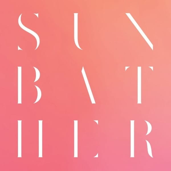
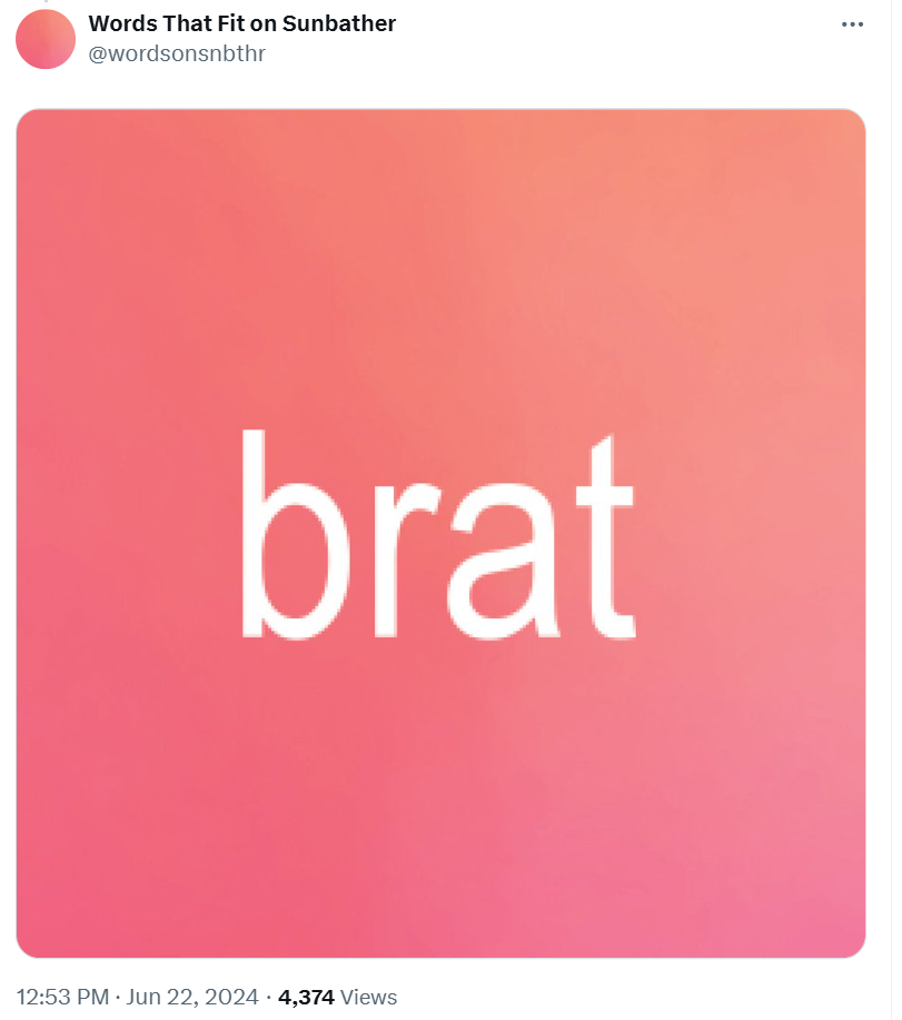
An important antecedent to Brat itself is Deafheaven’s Sunbather, whose distinct cover, with its cutesy gradient and highly contrasting font, launched a thousand Pitchfork-pilled memes as well as a Twitter account dedicated to putting different words on the Sunbather cover. They’re still at it:
Happy Honda Days for all those who celebrate! pic.twitter.com/bh6tlLxV9X
— Words That Fit on Sunbather (@wordsonsnbthr) December 23, 2023
At some point, the Sunbather font became so ubiquitous that somebody realized it would be a good idea to build it out into an actual typeface and start selling it, which is exactly what Deafheaven’s label, Deathwish Inc., did. Whoever came up with this idea is a genius. According to the Deathwish website, Nick Steinhardt, the designer behind the whole thing, was influenced by “early 20th century experiments by Swiss typographer Jan Tschichold.” Boom.
It used to be that when you bought a CD, the label — and by extension, the artist — didn’t necessarily have a financial interest in whether you liked the record, or even listened to it. They’d already gotten their thirteen bucks and split it among the necessary parties, and that was that. Now that we all live in Streaming World, though, the artist and whatever team they have around them need a bunch of fucking people to listen to their music a bunch of fucking times in order to actually make money off of it. (This isn’t to say that an artist’s music can’t be an effective loss leader that drives other forms of revenue, but that’s not what we’re talking about here.)
The memeing of Brat can be looked at as a form of guerilla marketing, creating a self-perpetuating feedback loop that continually reminds people that the preferred popstar of the hyper-online has an album out, over and over again, until listening to the record becomes part of the meme cycle itself. The implication here is that if Brat memes continue to travel, then the album is Actually Good and worth listening to, because the staying power and evolution of the meme functions as a stand-in for the staying power of the record itself. See the memes, play “365,” rinse, repeat.
Funnily enough, the Brat meme machine also mirrors the narrative that fans of a star of Charli’s ilk view themselves at the center of: The early diehard stans spread the good word about the idol, who rises from the underground to higher and higher echelons until they’re the biggest thing in the world. The fans are on the inside; they know the lore, and through Charli’s increased status, they help drive the narrative alongside her. And because Brat is an album of winks and overly personal camp, every resulting meme that comes out of it, for now at least, carries with it an implicit vote of confidence in the continued relevance of Brat.
This is a fundamentally different relationship between audience and creator than the one that, say, Drake enjoys. The cover of Views from the 6 or his poses in the “Hotline Bling” video serve as fodder for the memes of others, and he and his team must have had at least an inkling that they were providing the raw materials for people to screenshot, Photoshop, parody, and iterate upon, they weren’t straight-up creating the engine driving the memes themselves, and taking pains to always point them back towards the record, like Charli and her team have done. It's unlikely that your angry uncle posting Biden Hotline Bling macros on Facebook has even heard the song. Meanwhile, part of the point of doing a video where you’re wearing a Brat green shirt is that you’re also listening to “The Girl, So Confusing.”
Kudos to the Young Angel for gamely rapping over “BBL Drizzy,” though.